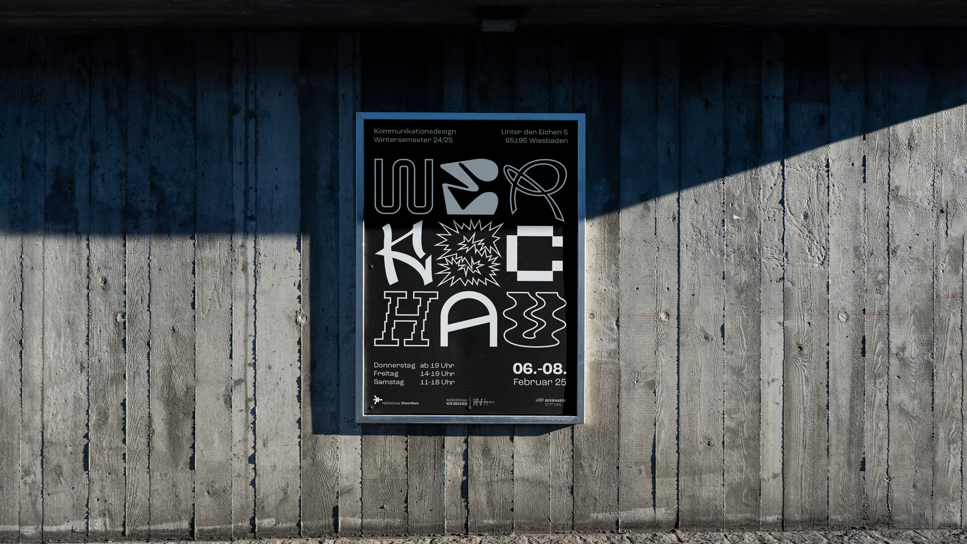
Werkschau
At the end of every semester, students at Hochschule RheinMain organize the Werkschau, an exhibition where Bachelor’s and Master’s students present their work. Together with a team of fellow students, I developed the corporate design for the Werkschau of the winter semester 24/25. We created a custom font for the with unusual shapes for each letter. To keep the focus fully on the letterforms, we chose a simple black-and-white color palette and designed visuals that could be used across all platforms.
I designed the poster and, together with the team, created the event catalogue. Closer to the exhibition, I also took care of the room planning and the information design, so visitors could easily find their way around the building. As a last-minute idea, we also designed stamp cards and placed stamps in every exhibition room to motivate the visitors to check out every piece of work. Once they filled up their card, they could even win a magazine.
In the end, the exhibition was a big success, around 500 people came by over three days. It was a lot of fun to be part of such a comprehensive project, and even more rewarding to see it all come to life. I also learned a lot about organizing an exhibition and how many different areas are involved.
Year
My Role
2025
Corporate Design, Catalog, Poster, Room Planning, Information Design
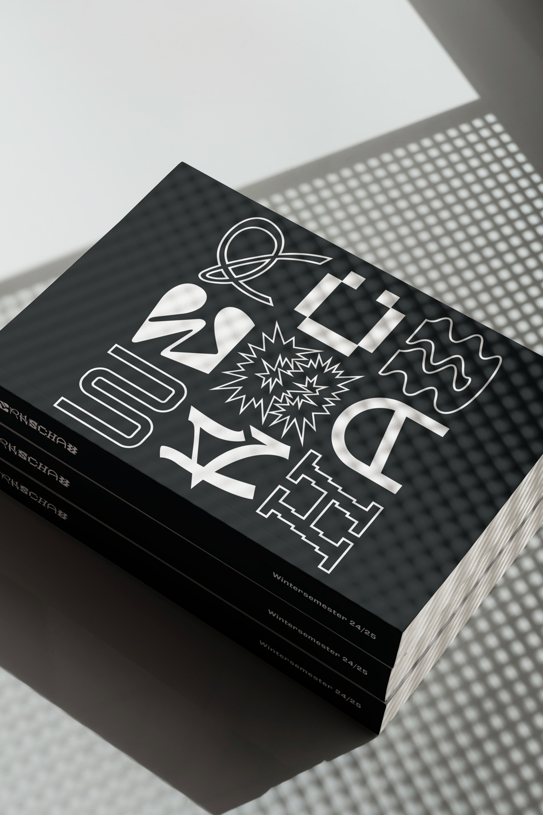
Catalog
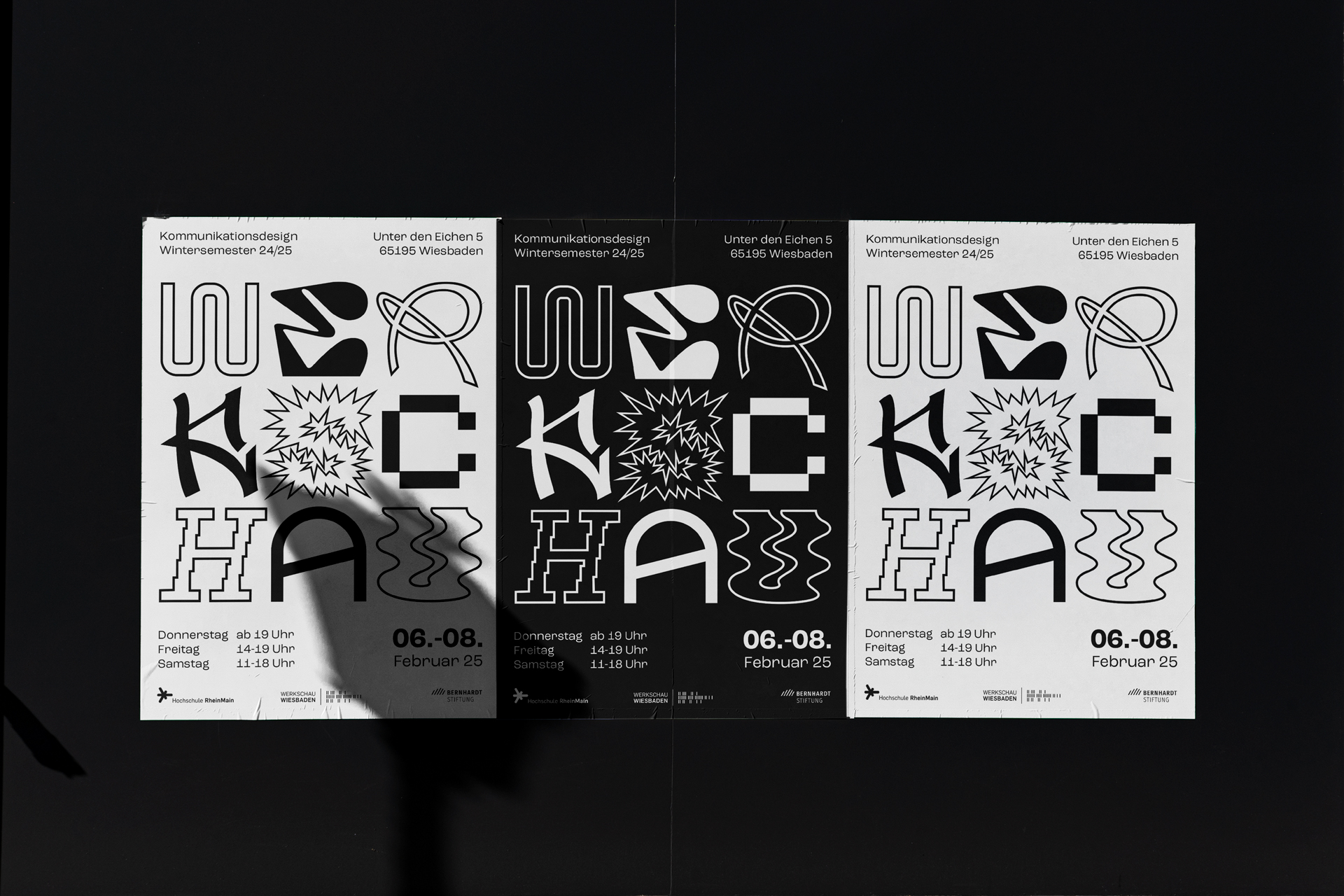
Posters in both versions
Insight of the pages of the catalog
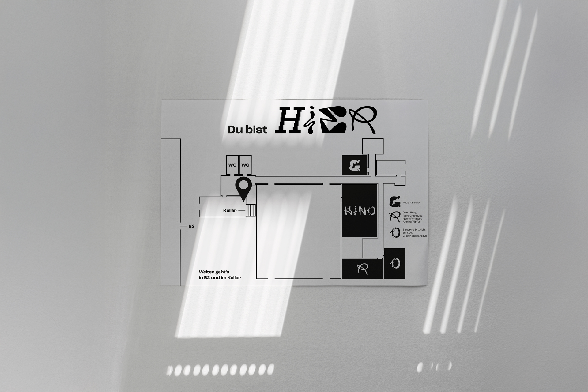
Room Plan to show the visitors where they are
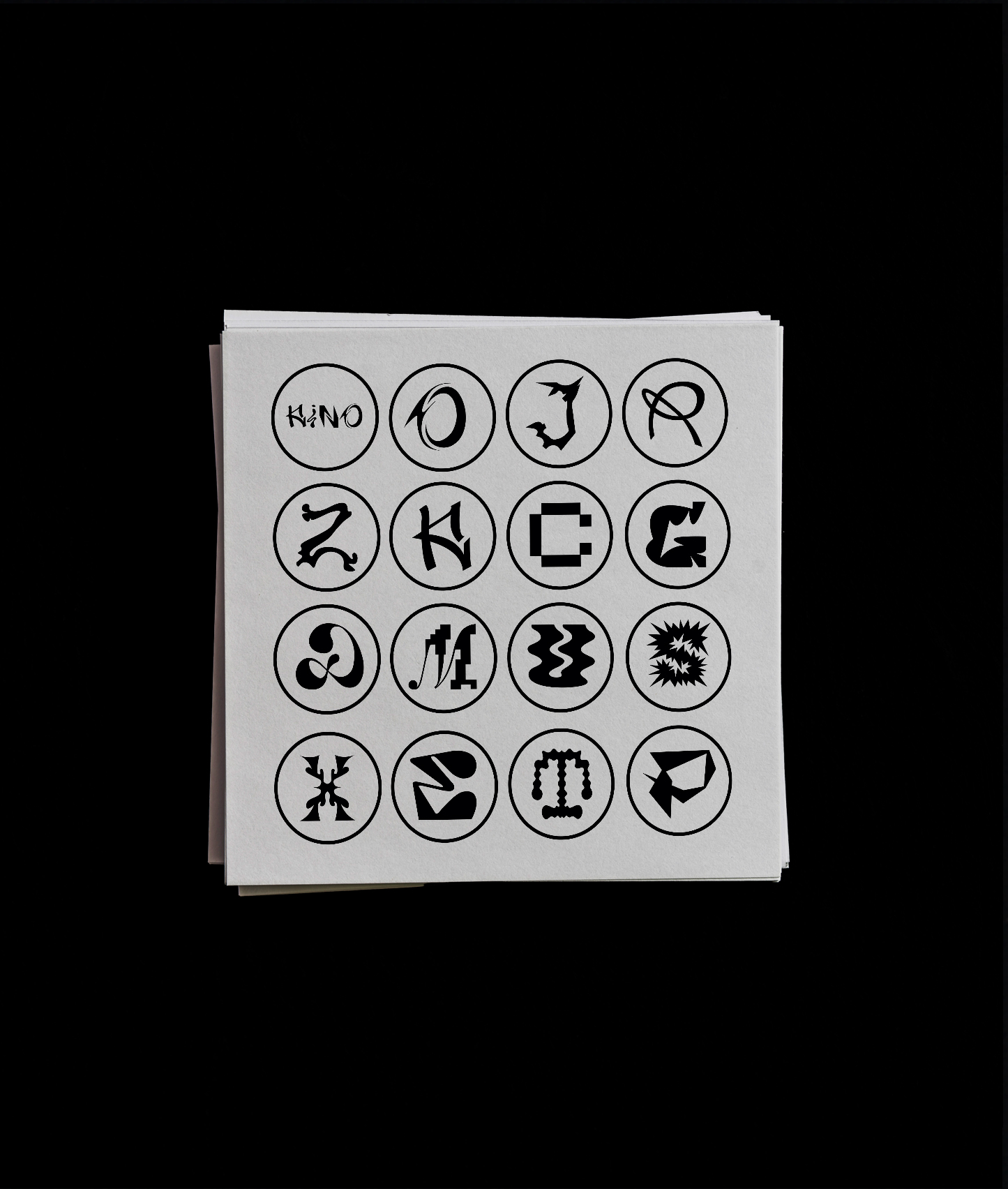
Stamp cards with stamps in every exhibition room
Impressions of the exhibition
Corporate Design
Alphabet of the new Werkschau font and the resulting visual

Colours
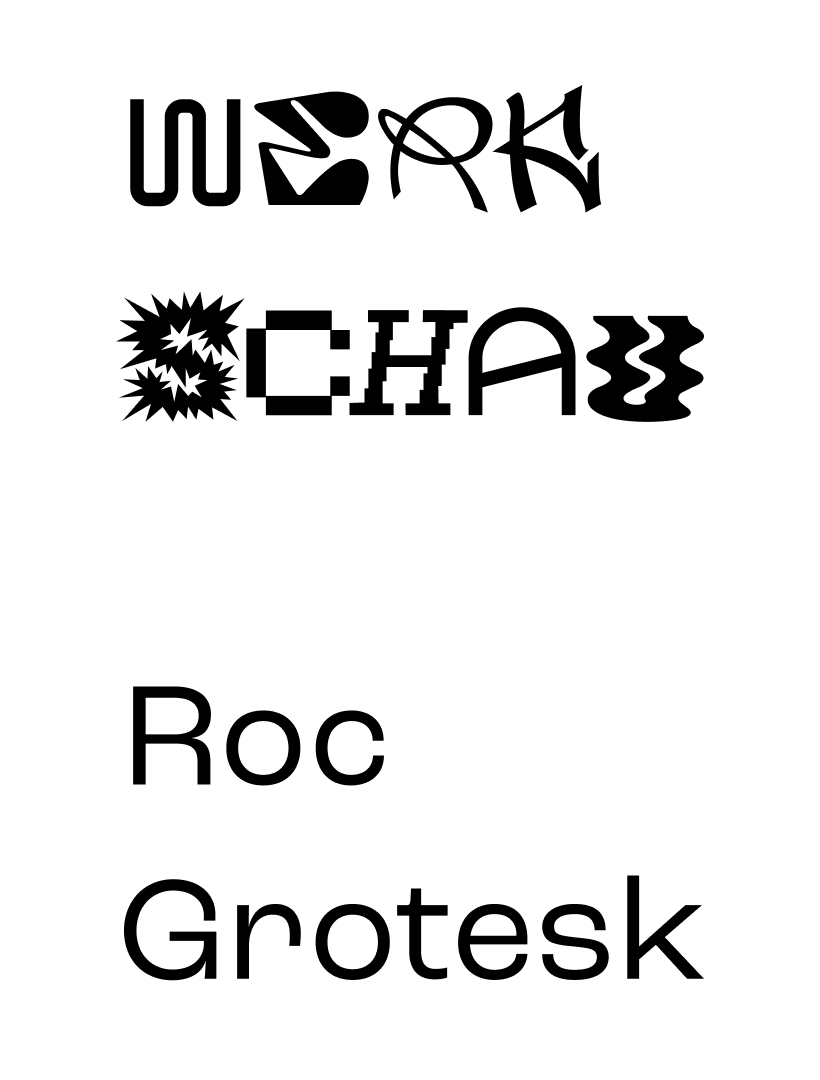
Fonts
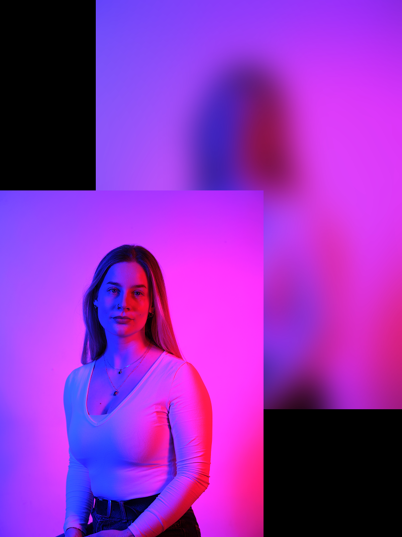
Imagery
Process
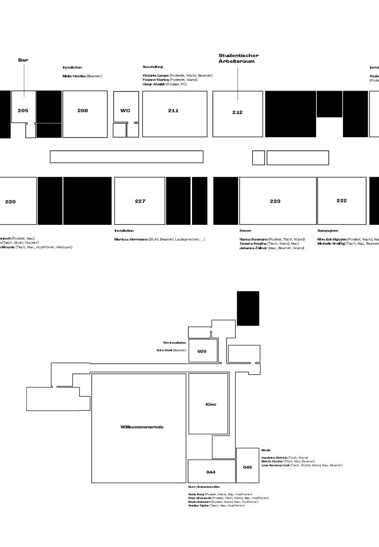
Room planning
Moods